You’ve spent so much time crafting a responsive experience for what was once exclusively for desktop. You can see the light at the end of the tunnel. Then you’re hit with the dreaded question, “How do you integrate the responsive UI into your acceptance test suite?”
Panic sets because you know the impossible has arrived.
BREATHE.
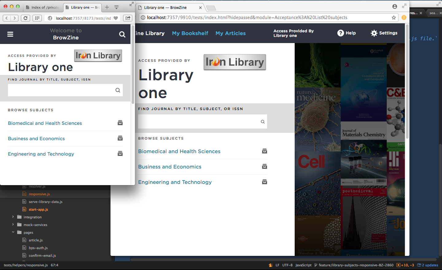
On our front-end team, we’re on a push to retrofit a mobile responsive UI/UX onto an existing desktop ember application.
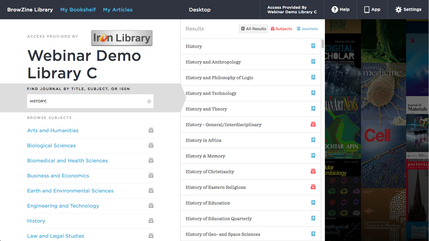
Using ember-responsive, we’ve made some initial progress so far.
The goal of ember-responsive is to give you a simple, Ember-aware way of dealing with media queries. The key way ember-responsive meets this goal is by providing you ember computed properties that change based on your applications responsive breakpoints. These resulting media-* classes help us avoid using more media queries than we need.
Our acceptance test suite is mature and it would be awesome if we can run those same tests against a mobile form factor (even if it’s just a desktop browser resized). Obviously, this is challenging because web browsers disable window.resizeTo and window.resizeBy APIs. So it is not practical to programmatically resize a web browser during tests.
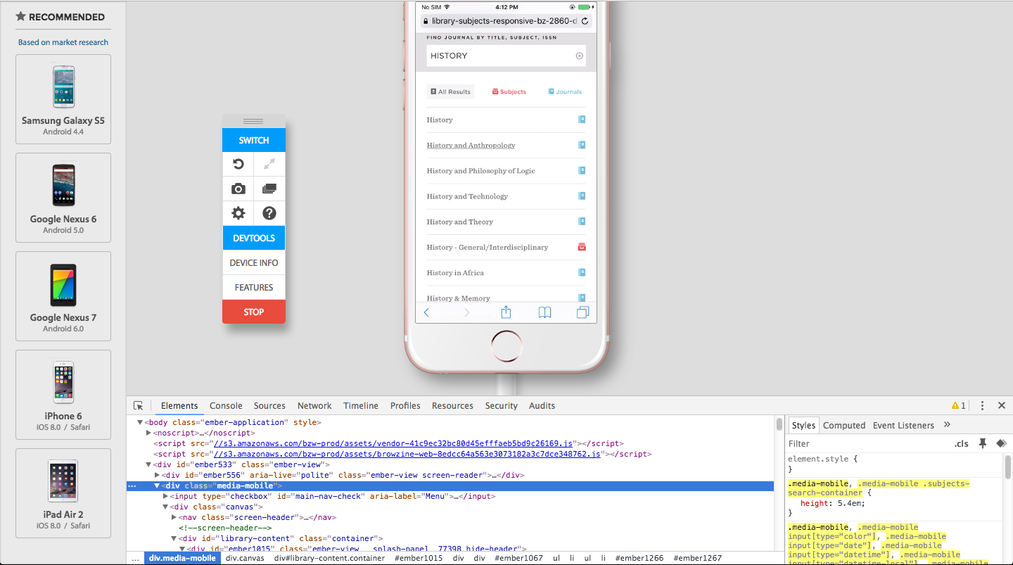
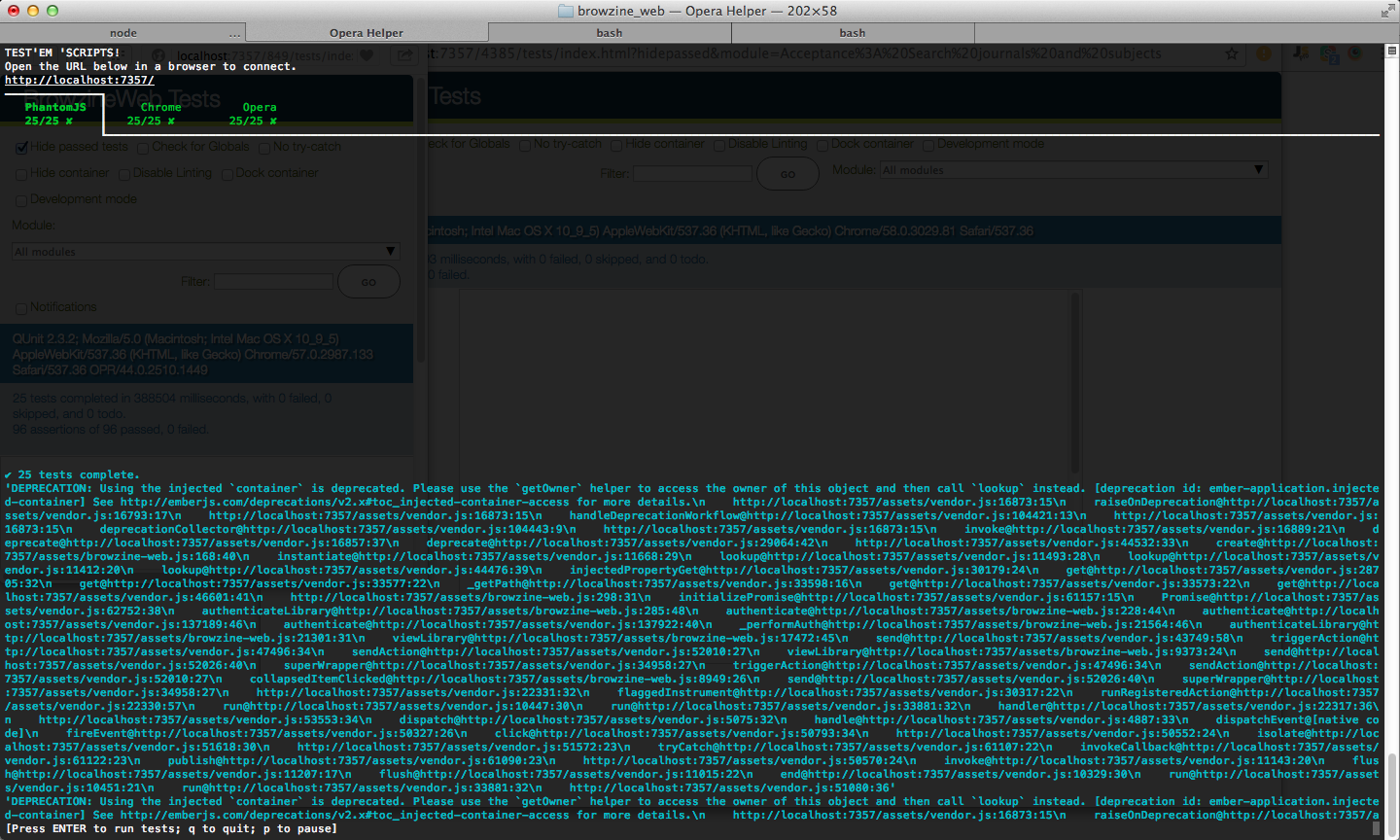
We’re able to update ./testem.js to resize, at-least, Chrome/Opera during an ember test -s run.
module.exports = {
  "framework": "qunit",
  "test_page": "tests/index.html?hidepassed",
  "disable_watching": true,
  "launch_in_ci": [
    "PhantomJS"
  ],
  "launch_in_dev": [
    "PhantomJS",
    "Chrome",
    "Opera"
  ],

  "browser_args": {
    "Opera": [
      "--window-size=320,600"
    ]
  }
};
The tough part, unexpectedly, was getting ember-responsive to inject our media-* classes during acceptance tests. But if we could just get that piece working, then we would have a shot at getting the responsive form factor itself under test.
I reached out to the ember-responsive maintainers and they were very helpful in understanding what options we had to inject the media-* classes during acceptance test runs. Of the two options, removing the ./tests/helpers/responsive.js helper seems to be the most flexible so far.
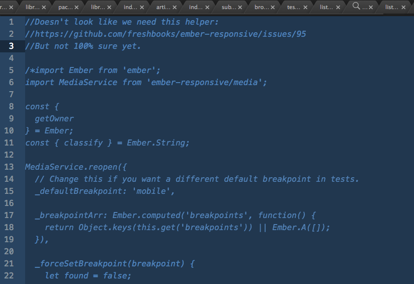
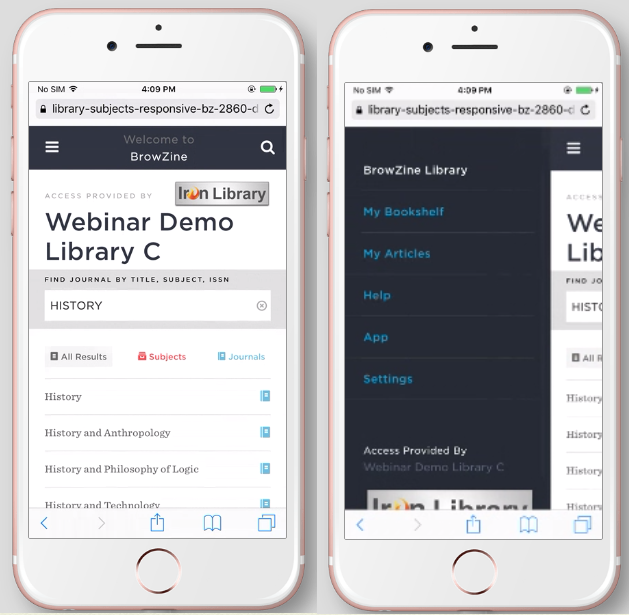
With the removal of ./tests/helpers/responsive.js, media-* classes inject as expected. Now, with the new Opera instance resized to hit the media-mobile breakpoint, we’re able to run our acceptance tests against the mobile form factor.
I think the key during the conversion is validating which class names/id names/etc are used for clicks/inputs/interaction/etc. Once we use those classes/ids on the responsive side, then BOOM, the acceptance tests can interact w/ the responsive UI and validate things are working. Missing functionality should break the tests in the Opera instance as expected.
Ideally, we’d have an actual mobile browser, running on an actual mobile device, but that option doesn’t seem available to any team at the moment. So if you’re stuck figuring out how to bring your responsive ember application under test, give this approach a try.